 国外主机测评 - 国外VPS,国外服务器,国外云服务器,测评及优惠码


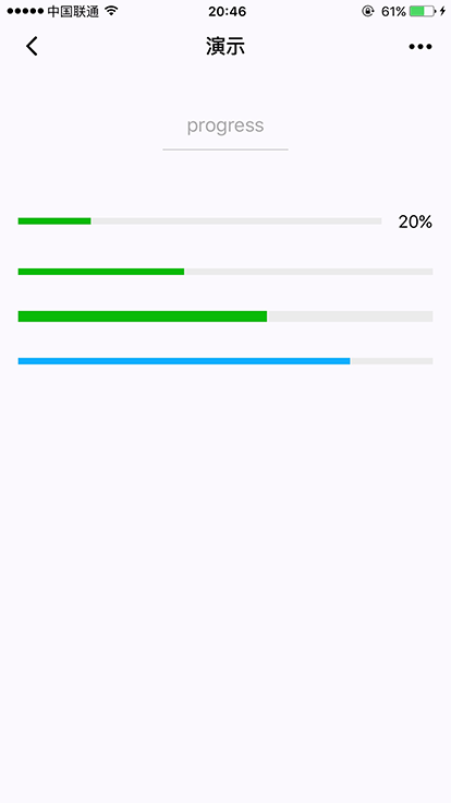
progress
基础库 1.0.0 开始支持,低版本需做兼容处理。
进度条。组件属性的长度单位默认为px,2.4.0起支持传入单位(rpx/px)。
| 属性 | 类型 | 默认值 | 必填 | 说明 | 最低版本 |
|---|---|---|---|---|---|
| percent | number | 否 | 百分比0~100 | 1.0.0 | |
| show-info | boolean | false | 否 | 在进度条右侧显示百分比 | 1.0.0 |
| border-radius | number/string | 0 | 否 | 圆角大小 | 2.3.1 |
| font-size | number/string | 16 | 否 | 右侧百分比字体大小 | 2.3.1 |
| stroke-width | number/string | 6 | 否 | 进度条线的宽度 | 1.0.0 |
| color | string | #09BB07 | 否 | 进度条颜色(请使用activeColor) | 1.0.0 |
| activeColor | string | #09BB07 | 否 | 已选择的进度条的颜色 | 1.0.0 |
| backgroundColor | string | #EBEBEB | 否 | 未选择的进度条的颜色 | 1.0.0 |
| active | boolean | false | 否 | 进度条从左往右的动画 | 1.0.0 |
| active-mode | string | backwards | 否 | backwards: 动画从头播;forwards:动画从上次结束点接着播 | 1.7.0 |
| duration | number | 30 | 否 | 进度增加1%所需毫秒数 | 2.8.2 |
| bindactiveend | eventhandle | 否 | 动画完成事件 | 2.4.1 |
示例代码
<view class="progress-box">
  <progress percent="20" show-info stroke-width="3"/>
</view>

<view class="progress-box">
  <progress percent="40" active stroke-width="3" />
  <icon class="progress-cancel" type="cancel"></icon>
</view>

<view class="progress-box">
  <progress percent="60" active stroke-width="3" />
</view>

<view class="progress-box">
  <progress percent="80" color="#10AEFF" active stroke-width="3" />
</view>